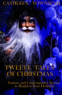
My thanks in advance to everyone for taking a look at these.
All these images came from Pixabay and are attribution-free for commercial use.
All the type is merely a placeholder. I’ve learned that not everyone can picture things that aren’t there, so I’ve made some mock-ups. But Deranged Doctor Design will do my font, better than I can do it myself (learned that lesson with Dragon Hoard).
My understanding of covers is that the most important thing they do is make a promise to the reader. I approached my image quest with that principle in mind.
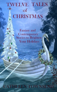 1. Swan boat
This image will need a lot of work, to the point that if this is the winner, I’ll probably just repaint it with a brush. The rear oars need to go, the boat needs a cast shadow, and the oval shadow on the left margin needs to be deleted. The Christmas tree needs shortening and probably won’t have any topper to distract you from the font.
Advantages: It clearly promises both fantasy and Christmas. I like the thought of a swan boat as a metaphor for the book.
Disadvantages: The book doesn’t have a story with a swan boat or swan in it, although I don’t think that’s a big deal. The real disadvantage is that this image lacks some of the contrast of the others, which might make it less effective as a thumbnail. That’s something I could address if I repainted it.
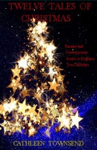 2. Gold star tree
This is the first image I chose months ago. I mention this because sometimes I overthink things when I should’ve gone with my gut response.
If this image is chosen, I can’t see anything that needs to be done to it at all. I’ll probably just use it as is.
Advantage: The contrast is very strong, which will make it a compelling image in thumbnail. And it’s ready to go.
Disadvantage: It hints of magic to me, but it doesn’t overtly promise fantasy in the same way the swan boat does. The cone shape suggests a wizard’s hat to me, but my mind can be an idiosynchratic place, and other impressions may differ.
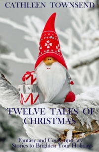 3. Christmas gnome
This is another one that’ll have to be repainted if chosen. Even if I add more ice and snow to the branch to make it more friendly for type, it’s still a picture of an ornament, and I’m not sure that’s classy enough for a cover.
Advantages: It has red which draws the eye and clearly promises fantasy and Christmas.
Disadvantages: The contrast isn’t awesome, although that could partly be remediated with dark font. One commenter on Absolute Write said this was her favorite image, but she thought it promised a children’s book. A more realistic smile, like that in the cover below, could possibly address that issue.
 4. Christmas wizard/Santa (viewer’s choice on this one)
In Photoshop, I would go blind trying to fix this image. The rubber stamp tool would become my very best friend. So many white hairs to clean up, along with some visual noise in the blue puff balls on the right. And it’ll still be a picture of a doll, which I don’t think is classy enough as a cover. So this is another that’ll need to be redone in paint.
Advantages: The contrast on this one is awesome. It really pulls the eye in thumbnail. And I do have a couple Santa stories in my collection.
I can’t think of a disadvantage to using this, other than the work involved in translating it to paint. I guess some people dislike faces on covers. I suppose the ambiguity of the central figure on the cover could be either an advantage or disadvantage.
 5. Snowflake background
I didn’t bother to put font on this because it’ll basically be all font, and mine is pretty tame.
Advantages: Image can be used as is, and the contrast could be great with something like gold lettering. Also, I have a snowflake story in the collection.
Disadvantage: I have a cordial dislike to all-font covers. They lack an image to pull readers in, and I’m not sure that’s wise.
***
 Another advantage to consider is that an image I paint will help brand my work, since I painted all my other covers. I know, I’ve only published one book that’s all my own work so far, but I’ve painted six more covers, and the style seems to be reasonably consistent with my art on Dragon Hoard. I can easily ask Deranged Doctor to use the same font.
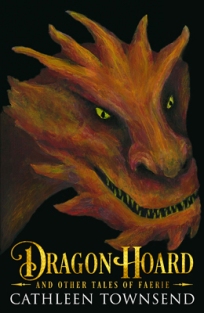
I haven’t updated the graphics on my site yet, so I’ll include the cover of Dragon Hoard here in case anyone has an opinion on the font. Do you think I should ask Deranged Doctor to use the same one to help with branding?
Which cover image do you like? And if you don’t mind sharing, are you in the target audience for a collection of fantasy and contemporary Christmas stories?
Share this:

Avid writer and reader of Faerie tales and noblebright fantasy.


The Swan Boat (with your suggested changes) is the most attractive and would suit Fantasy Tales (it projects Christmas and Fantasy regardless of no swan story) – also, I’d suggest bright red text would stand out more.
You’d need to shorten the Gold Star Tree to leave more room for the title (White text would stand out best, but gold might work)
The Snowflake Background could work well with white or gold text, but enlarging or overlapping mirrored images, to suit your book size, might be problematic.
The Christmas Gnome is cute, but possibly better suited to a book for children.
The Christmas Wizard/Santa is too fussy and amateurish.
Hope this helps, Cathleen 😎
LikeLiked by 1 person
Thanks so much, Chris. That’s exactly the kind of feedback I need. 🙂
LikeLiked by 1 person
Welcome, Cathleen 👍😃
LikeLiked by 1 person
I really love number 2 it is perfect!
LikeLiked by 1 person
Thanks, Willow, for weighing in. Really need these opinions. 🙂
LikeLike
Pleasure 💖
LikeLiked by 1 person
Wow, lots of choices to consider. I was an art teacher and commercial artist for many years, so I’m throwing those experiences into the ring. For a book cover: You want the titling to come forward most, (Shows your name and name of book) the image to draw your reader in next, (Ooh, that’s pretty, mysterious, thrilling, romantic, scary, powerful – whatever is the context you want to project) and relationship between image and story last (Sure, I like stories about Christmas, travel to secret places, exotic snow animals.)
We are at a bit of a disadvantage because we don’t know any of the stories. Are these family tales, or dark or weird or – what? The cover must project the tone of the stories or you run risk of angering or disappointing your readers. Also, every part must fit together as if they were born connected.
Your idea of painting your own image based on one of these is a good idea as well as going with the same font from Dragon Hoard. It’s the same tone that reminds a viewer – “Yeah, I remember the other book and I liked it. So I’ll like this book too.” I like consistency in covers – it presents YOUR brand and that’s important to establish as a “newer” writer. Use the same font and general composition, change the text colors if that would work better. Your contrast needs to come between the image and the text, not necessarily within the artwork. Contrast within art can always be imposed by using a darker background behind the image.
Swan boat: this image suggests fantasy and romance. If you use it, reduce the image, (the tree is too tall) the boat does not need a cast shadow unless that would suggest darkness in your stories and only if darkness is in your stories. Get rid of all oars.
Gold star: literally hurts my eyes. If you want to use this one, reduce the image a bit and let the text demand more stage attention with bright red color. Maybe try to tone down most of the stars and let only a few really shine. My least favorite.
Gnome: this one is definitely a kid’s book image, but you could work with it by making his face that of an old man, maybe a bit of a Scrooge or a little devilish. Get rid of the presents.
Wizard: instead of photoshopping, why don’t you try to paint this one instead? You painted the dragon, didn’t you? Focus on his face and center it, get rid of the puff balls altogether, reduce the fuzziness of the beard. Father Christmas, here, but maybe not the guy you want to give your wish list to.
Snowflake: not bad as a background but it does need a compelling image imposed over it – think of another Christmas icon that would work with your story – maybe a sled? Pull something from one of your stories.
I agree that for a book about Christmas, all font is not wise.
Good luck, Cathleen.
LikeLiked by 1 person
Wow, Sharon–you were so generous with your feedback.
As far as the tone of the stories, they are mostly light, with somber moments, much like the stories I’ve blogged. There are four non-steamy romances among the twelve stories, although one has a bittersweet ending. Especially since this is a Christmas collection, I wanted it to be something to uplift.
Still, you need conflict in stories, and my characters deal with grief (both over the death of a loved one and abandonment), a life-threatening plot complication (in the case of Dragon Yule), loneliness, and guilt over not being able to provide for their families due to the cruddy economy.
Thanks also for weighing in on branding consistency. 🙂
LikeLiked by 1 person
Sounds a bit of DIckens – I like that. Christmas but thoughtful and wistful – very compelling.
LikeLiked by 1 person
I LOVE A Christmas Carol. If I can ever pen a story that compelling, I’ll consider myself a writer. 🙂
LikeLiked by 1 person
I like the swan boat the best, the gnome second. The other two, the words are really hard to read.
LikeLiked by 1 person
Thanks, Paul. The font is just a placeholder–I know my typography abilities aren’t up to book covers. I just put it there so people could get an idea of the space it will use up.
Thanks for chiming in. So far, with a limited sample here, with real-life friends, and on AW, the swan boat seems to be winning. Although that could change if I get more folks to opine on the subject. 🙂
LikeLike
My thoughts…
I like the Swan Boat. It does promise fantasy and Christmas. For me, it doesn’t matter if there is a story about swans, I saw it a more a ‘delivery of stories’.
Gold Star is a common image seen around the net on the holidays so it puts me off right away as a cover. It’s not original enough.
Christmas Gnome is good and with red type will pop. I don’t necessary see children’s stories but do see cute, fun, happy, peppy stories. That might be fixable too.
For me, the Christmas Wizard make me think spooky, maybe horror.
For the snowflake background, you could maybe add a white or silver ornament reflecting something from one of the stories (or even the swan). You can find ornaments on Pixabay and the reflection is a fairly easy technique.
LikeLiked by 1 person
Thanks, Southpaw. I like the swan boat, too. I like all of them, actually, but my limited sample seems to be tipping in the direction of #1. I wanted to get some feedback before I sunk a ton of work into a cover, especially since it looks like I’ll just be using this as a model for the finished piece. 🙂
LikeLike
I love the gold star tree – so vibrant and exciting. Reminds me of Christmas. I would definitely buy a book like this – I love Christmas.
LikeLiked by 1 person
Thanks. I like that one, too. And I wouldn’t have to pick up a brush to get it done. There’s a certain attraction in being done with this project, so I can move on to the next. 🙂
LikeLiked by 1 person
It’s early for Christmas!
Gold star tree … is perfect!
Good night!
Francesco
LikeLiked by 1 person
Thanks. I know–it’s odd to be fussing about Christmas now. But I need to finish or this book won’t be ready for the next one. 🙂
LikeLiked by 1 person
I would pick up and read swan boat. To me it says fantasy AND Christmas, not just Christmas.
LikeLiked by 1 person
Thanks, Jessica. So far, the swan boat is getting more votes than all the others put together. 🙂
LikeLike
Subject to some slight modifications, the Snow boat looks elegant and ideal.
LikeLiked by 1 person
Thanks, Jo. All this feedback is very helpful. 🙂
LikeLike
The first image is my vote, Cathleen.
LikeLiked by 1 person
Thanks so much, Jennie. You seem to be a majority. 🙂
LikeLiked by 1 person
🙂
LikeLiked by 1 person
Hi.
I think I like number one the best.
Good luck!
LikeLiked by 1 person
Thanks so much for voting! 🙂
LikeLiked by 1 person
I love the Swan Boat — fantastical and unique.
LikeLiked by 1 person
Thanks for the vote–and the confidence booster on using that image. 🙂
LikeLiked by 1 person
#1 Swan Boat is my favorite! 🙂 xo Sharing…
LikeLiked by 1 person
Thanks so much, dear Bette. ❤
LikeLiked by 1 person
They are all good, but for some reason I like the last one the best. Maybe because it seems to represent both Christmas and Fantasy?
LikeLiked by 1 person
Thanks so much, Ann. 🙂
LikeLiked by 1 person
I like the swan boat.
LikeLiked by 1 person
Thanks–and you seem to be in the majority. 🙂
LikeLiked by 1 person
I also like the Gold star tree, but just looking at it from my computer monitor, the red font disappears. I also warn against using red letters in anything online (print is different), there are a large number of folks who are color-blind in the red/green spectrum. When I managed websites for a public organization before I retired, we could not use red lettering anywhere. Plus I like Christmas trees and this on is sparkly and pretty!
LikeLiked by 2 people
Thanks so much, Terri! 🙂
LikeLiked by 2 people
I like the Swan Boat
LikeLiked by 1 person
Yeah, that horse seems to be running away with this race. Thanks. 🙂
LikeLiked by 1 person
The swan boat grabs my attention and draws me in.
LikeLiked by 1 person
Thanks, Lynda. It looks like that one is the clear winner. 🙂
LikeLiked by 1 person
The swan boat gets my vote, Cathleen. It is festive and fantasy rolled into one image. Two suggestions on font: (1) the one on Dragon Hoard is decorative and suits the holiday season; (2) it would really catch the reader’s eye if it were bolder, if it alternated holiday colors, and if the colors matched the red and green in the wreath around the swan’s neck ~ e.g., the title and your name in red; the mid text in green. Lovely of you to ask for feedback ♥
LikeLiked by 1 person
Actually, I’m leaving the font up to Deranged Doctor Designs, the cover artists who put font on Dragon Hoard, but it wouldn’t surprise me if they came up with something similar to what you suggest. Font is just not an area of strength for me. I can come up with something that doesn’t look homemade, but it’s not quite good enough, if you know what I mean.
I’m glad you like the swan boat. I’ve been working up sketches so I can paint that image. That’s an area I do feel confident in.
Thanks so much, Tina. 🙂
LikeLiked by 1 person
You’re welcome, Cathleen. I’m sure the end product will be magnificent ♥
LikeLiked by 1 person
Thanks for the attagirl. My fragile writer’s ego can always use them. 🙂
LikeLiked by 1 person
Welcome, Cathleen. You are not alone 🙂 ♥
LikeLiked by 1 person
Although your obvious winner is the swan boat
I love your gold star tree
but the font is a little difficult to read. My second choice is the gnome as it is so bright and eye catching. Best of luck with your publication.
LikeLiked by 1 person
Thanks so much, Marie. Yeah, I think I’m going with the swan boat, but I like the gnome enough that I may write a short story about him. 🙂
LikeLike
Cathleen, sounds like a good plan, he’s too interesting to ignore.
LikeLiked by 1 person
The Swan Boat wins hands down! 🙂
LikeLiked by 1 person
It’s always nice when you aren’t faced with any difficult choices. I’ve decided to enjoy this.
And thanks for weighing in. 🙂
LikeLike
I like the gnome with more prominent type, maybe parts of the picture blurred to be fuzzier. Any of these would be great done right.
LikeLiked by 1 person
Thanks, Jacqui. Yeah, on font I’ve definitely decided to leave it to the pros. There’s just too much art to it, and I don’t have the time and interest to become an expert. 🙂
LikeLike
Wow, Cathleen. I like 1 and 3.
LikeLiked by 1 person
Thanks so much, Cynthia. 🙂
LikeLiked by 1 person
I like the first one, but it doesn’t sing out Christmas; and I also like the second one, but the red font is lost in the background. Perhaps a lighter colour?
LikeLiked by 1 person
Yeah, my cover designer already advised lightening the sky on the swan boat, so there you go–great minds think alike. And I’m repainting the image, so I’m going to bring more red into it as a foil for all the dark green. Hopefully, that will help. 🙂
LikeLiked by 1 person
I am sure it will 😀
LikeLike
Isn’t it fun to pick covers. Nerve-racking but fun. I love #1 – so beautiful, but I agree that if it doesn’t relate to one of the stories that could be misleading. I also like #4 – the Santa – it lends itself to a variety of tales. To me, the gold star tree doesn’t say much, and the gnome is too children’s story-ish. Hope that helps. I’ve been swamped with family emergencies and childcare, but will get going on the beta read soon. Promise! 😀
LikeLiked by 1 person
No worries, Diana–get your life under control. It’s important not to lose track of that.
Even those who like the gnome agree it’s MG-ish. I think I’m going with the swan boat as a metaphor for the book, since it’s by far the most popular. Now I’m in the middle of trying to improve it with a paintbrush, and I’m stuck on the background. Maddening, but I’ll work my way through. 🙂
LikeLiked by 1 person