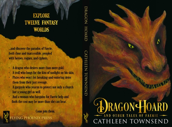
Hurray! I’ve got a new cover for Dragon Hoard. The illustration I painted is the same as the previous version, but Deranged Doctor Designs (www.derangeddoctordesign.com) revamped the font for me.
Normally, I know we usually go to each others’ blogs and say nice things. I like that about my life. But this is one of the times I’m going to ask you to be critical. This is the second draft they’ve sent me; I like it and am seriously thinking about telling them this one should work.
But the problem is that I want to like it, the probable source of the default blind spot writers all seem to need to overcome with their work. So I’d like to turn to less biased eyes, and ask everyone if they see something that can be improved, while I can still ask for revisions.
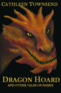
I’m already thinking the dragon’s eyes might need to be a bit more gold, and I’ve discovered someone else is using Flying Phoenix Press now, so that’s a lesson learned. I’m going to start a new site with Phoenix Flight Press right away, so nobody else decides to use that name while I’m still putting off the work involved in setting up something new. Or I could use Firebird Rising Press. Let me know if you have a preference in the comments, please.
Here’s the old cover if you’d like a standard of comparison. I decided that my best attempt at font was too staid–it needed more pizzazz. I think it was a decent cover, but covers need to be better than that.
So, what do you think?
Share this:

Avid writer and reader of Faerie tales and noblebright fantasy.


The cover is much sharper now with better impact, who knew the slight change in arrangement would make such a big difference.
The new cover is fab. 🙂
LikeLiked by 2 people
Yay! Thanks for the feedback. 🙂
LikeLiked by 1 person
Agree with Teherah, Cathleen 👍😃
LikeLiked by 2 people
Thanks, Chris. *insert happy dance here*
LikeLiked by 1 person
😄😄😄
LikeLiked by 1 person
Allâs I can say is good luck!
LikeLiked by 1 person
Luck never hurts–thanks. 🙂
LikeLike
Nice new cover! And you’re a very good illustrator
LikeLiked by 1 person
Thanks. It was the first dragon I ever painted (although I’d drawn some previously). Art school looks down on fantasy art, which was a drag because I felt awkward painting any. But now I’m in a class that’s basically a lab, so I can paint what I like. I know I can paint what I want at home anyway, but visual arts need feedback, just like writing does, so I like to get class critiques on my work.
LikeLiked by 1 person
I love the change, Cathleen. Much more fantasy-ish! I also agree that the dragon’s eyes might work better with a little more gold. They do nice work over there at Deranged Doctor. 🙂
LikeLiked by 2 people
I’m really happy with them so far. And I’m glad you like the change. 🙂
LikeLiked by 2 people
Love the new cover, Cathleen. However, I like your suggestion on more gold in the dragon’s eyes! 🙂
LikeLiked by 1 person
Thanks, Bette! The new gold font is golder than the last, and now the eyes read greener to me.
LikeLike
I like this. I’m not sure about calling more attention to the eyes. I think there’s a nice balance right now that might be disturbed if you do that.
LikeLiked by 1 person
Well, fortunately, the eyes are a part that’s under my control. I can tell Kim at Deranged Doctor to run with this version. The art is easy. Go to Photoshop and experiment with eye color. Look at variations until I go blind and fall asleep.
Sometimes I wake up with the right solution running through my brain. It’s nothing I can count on, but it happens enough that my optimism’s kicking in about it. 🙂
LikeLiked by 1 person
The new font “pops,” as the artists would say. It makes your cover more distinctive. Well done.
LikeLiked by 1 person
*throws hat into air* I was REALLY hoping I liked this designer. An acquaintance of mine recommended them, and I’m sitting with six covers painted, ready to go. They’ve got a five month wait for a whole cover, but they’re willing to work me in as font only in a matter of a couple weeks.
All part of my quest to have over a year sitting, ready and waiting, over at Amazon before I pull the trigger on this stuff.
LikeLike
The new cover is definitely looking better but fiery eyes could produce a better effect though this one is quite scary 🙂
LikeLiked by 1 person
Yeah, like I said in another comment, I’ll play with it. I may have to make a few highlights more intense, too. Changing one element in a picture often means touching up others as well. 🙂
LikeLiked by 1 person
I like the new font treatment. It stands out and goes with the imagery. I agree the eyes need to be brightened and “pop”, maybe the teeth too.
LikeLiked by 1 person
Yeah, I was wondering about the teeth. Might try a brightening layer on top of them, too. Thanks for the feedback. 🙂
LikeLike
Maybe whiten the teeth a bit and definitely take the greenish hue out of the eyes…so more gold, yes. I love the new title treatment! And I like both those imprint names. 🙂
LikeLiked by 1 person
Thanks so much, Rachael. Two fixes on the image shouldn’t be too hard.
I’ll probably go with Phoenix Flight Press. I want a phoenix because I just painted a new cool logo for it. 🙂
LikeLiked by 1 person
I love Phoenix Flight Press. 🙂 That will be awesome!
LikeLiked by 1 person
I like collected all the text at the bottom. The only thing that stands out is the subtitle is a bit hard to read–too dark maybe? Or it’s just me!
LikeLiked by 1 person
Yeah, I think the subtitle is too small to be read in thumbnail. The alternative, though, was to have the font covering more of the dragon’s face. *shrugs* I think this is the best compromise. 🙂
LikeLike
Cathleen, I don’t know how I missed this post before, but I’m glad I finally read it.
The more dramatic font and the slight overlap of your new cover push forward the power of the image – it’s more aggressive, less tentative, and better for a dragon. Dragon Hoard and your name really stand out.
Would you consider Phoenix Rising Press? Phoenix Flight Press doesn’t roll for me, my tongue stumbles. What do you have to do to “own” your name?
LikeLiked by 1 person
Ha–I just saw this, Sharon, so you aren’t the only one to have something slip past.
I’m afraid Phoenix Rising is taken. Drat. I like that one better, too. 🙂
LikeLike